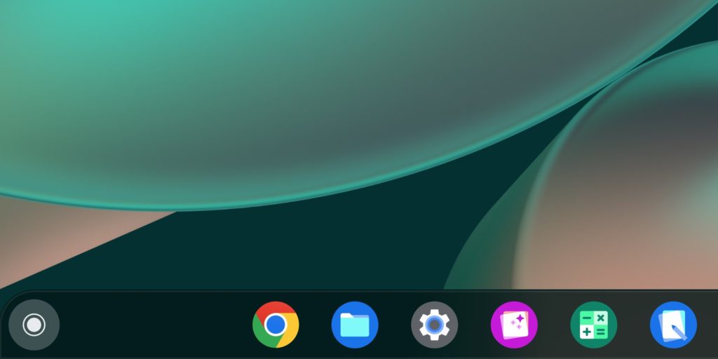
For the first time in almost eight years, the Google Chrome symbol is being redesigned and modernised. The business is currently optimising the logo for each operating system.
It follows the same fundamental design strategy as the original Chrome’s round, four-color basic style. Which Google flattened in a 2011 redesign. Subtle modifications, on the other hand, are on their way to your displays. Brighter colours, a wider blue circle in the middle, and no shadows distinguish the new logo.

The primary Chrome logo (the one you click to access the web from your dock/taskbar) will not appear the same on all platforms. The logo will be more colourful on ChromeOS to match the other system icons, and it will have a little shadow on macOS to make it appear as though it’s “bursting out” of the dock.
The Windows 10 and 11 versions, on the other hand, have a more dramatic gradient to match the aesthetic of other Windows icons. If you’re using Chrome Canary (the development version of Chrome), you’ll notice the new icon right away. But it will take a few months for everyone else.


The new logo will be implemented very soon across most of the platforms. We recommend following us on our Twitter thread. Outlining the modifications here if you want to learn more about what’s new.


